I am
Aaron Wong
My name is Aaron Wong and I am currently an undergraduate student attending the University of California San Diego majoring in cognitive science and minoring in computer science. I want this portfolio to be a little bit more than just a place to showcase my work, I want it to be a place where I can express my personality through my own interests.
This portfolio is still under construction
schoolSchool: University of California San Diego gradeExpected graduation: Winter 2019 My Resume
LinkedIn: https://www.linkedin.com/in/aaron-wong-795878170/ GitHub: https://github.com/FlamingC4 Email: aar34w23@gmail.com
A couple of projects I have worked on in my career.
The Beginnings:
and so, it starts...
Synopsis:
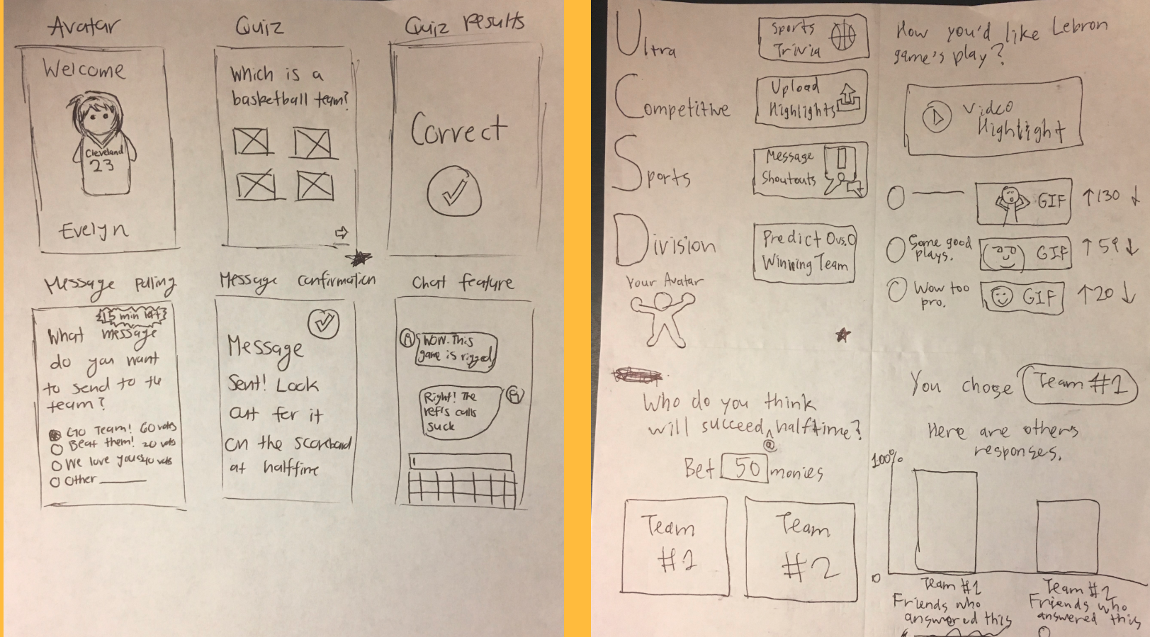
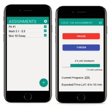
Do It Early is an app that helps you keep on track through user interaction. With this app, users can also set a start time for the assignment, and delay it if necessary. Throughout the project, we received feedback through our peers, which helped us iterate on the idea. Here, I will go over the design process and the thinking behind our idea.
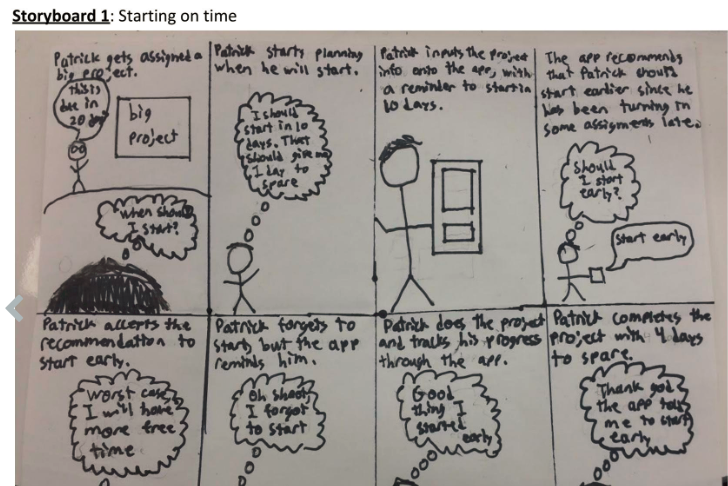
We started with cutouts of what we wanted our app to look like. We shot a video to demonstate an example user flow to the app. In addition, the video was further analyzed to make sure our prototype maintains the problem we are trying to solve: does it help users track their assignments.
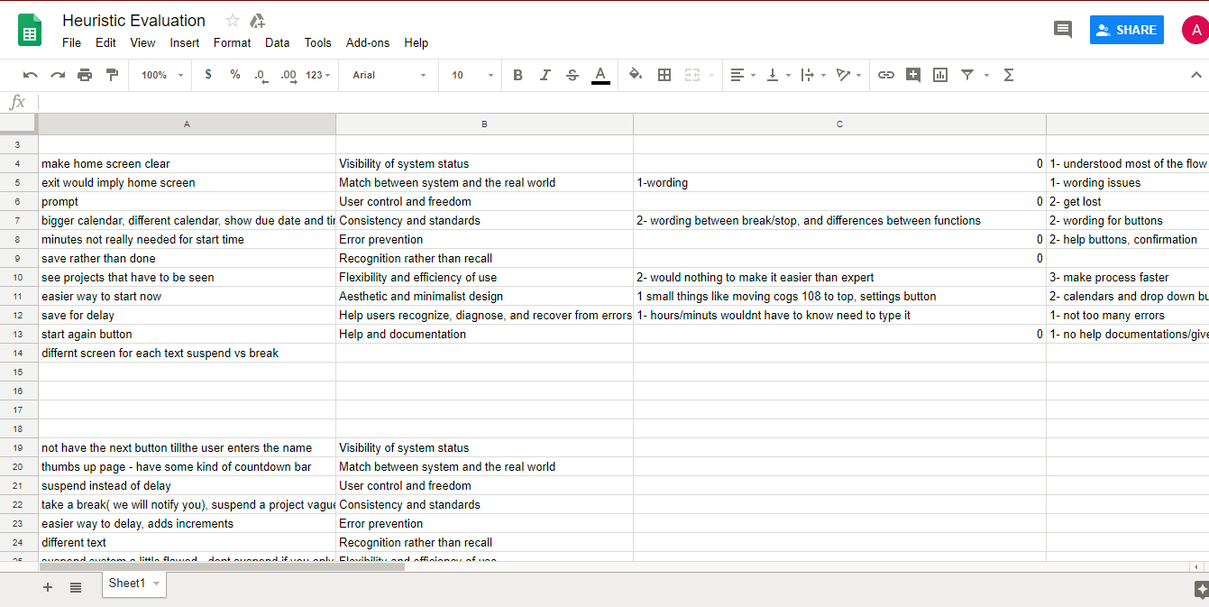
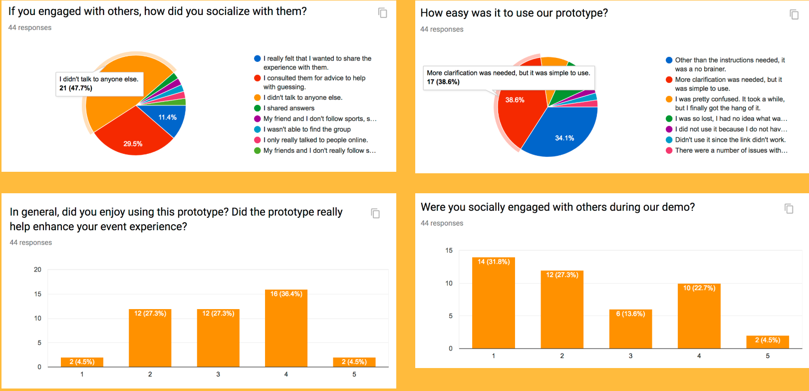
The next step was to have volunteers try out our app and give off feedback based on criteria called "hueristics". There, a score was given out for each hueristic category, with 0 being no trouble, to 4 being needs immediate changes. We used feedback to change our prototype as we were coding the app.
Taking into account the hueristic evaluations, we drew up our plans to make the interface more user friendly and iterated on the paper protoype design. Some changes include moving around a few buttons, clearing up the main screen.

Here, we started coding the app. We changed a lot of things in the final prototype. For example, first, we had users select the assignment date through drop down boxes. These boxes would highlight yellow if the user inputs the wrong data. We realized this was very hectic as users would spend up to a minute just to set up his/her assignnment.
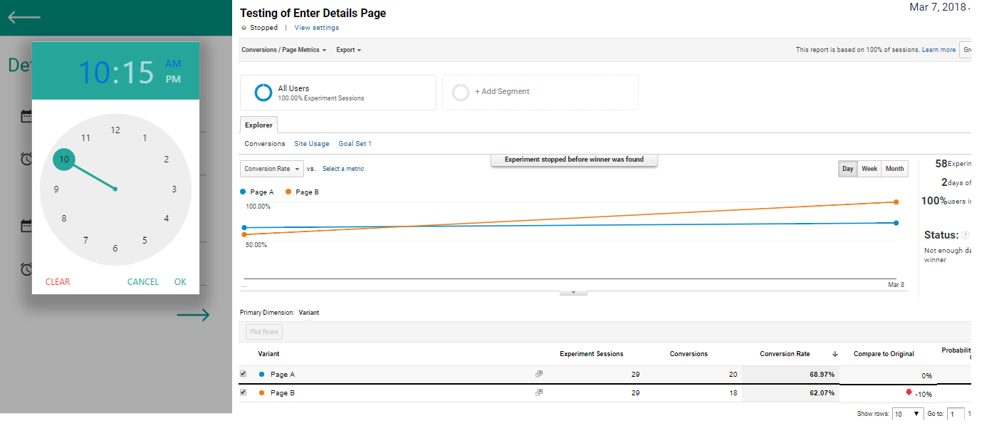
To iterate on our design we tested out another layout of the enter details page, with no drop downs and used google analytics to track the time people spent on the different designs. It turns out that replacing dropdowns with calendars and clocks helped speed up the process significantly.

Given that this app is only a prototype which focused more on the design rather than the coding, there are things that arent finished with the app. For example, the timer is still hardcoded and doesn't actually show what the user input. However, we inserted buttons to simulate what would happen when the countdown actually hits zero.
Of course, there is also the technical side...

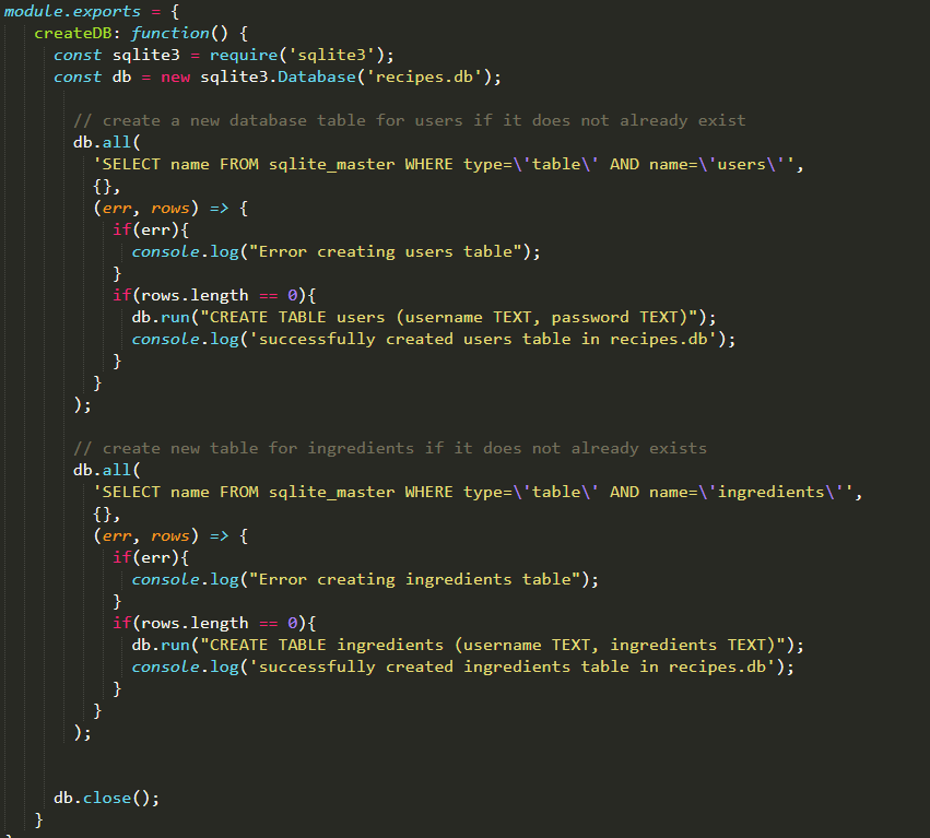
We used a "fake" database to store our data
All of the information about the projects are stored in a JSON file, meaning that our database is avaliable only when we run the application. This database is mainly routed to the enter-details page, as user input will be recorded here, such as when the assignment is due.
Node for the backend
Node was used to route through pages while using data from the JSON file. Node also allowed us to produce two different versions of our app and render pages differently depending on the version. This was used in Google Analytics where we compared two versions of the app.

Don't build from scratch
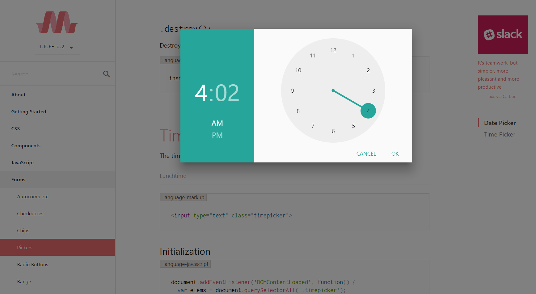
We found that using resources given were much more efficient than trying to code something by scratch. A useful tool we found was the materialize api. We liked the clock feature which was more efficient than having users manually inputting the time.
Sound Design
In order to create sounds that correspond to different alarms, we used Ableton to edit stock sounds. For example, for our "start working now" sound, a couple of equalizers were added to the sound in order to boost the bass to the point where the sound would clip and be uncomfortable to listen to. Here are a few sounds:
Original alarm sound cropped and slightly bass boosted
Original alarm sound filtered
Strong alarm heavily bass boosted (warning: turn down volume)
Enter checkpoint sound
The Take Away
DoItEarly was an interesting project: not only were we tasked with coding, but also the design. I learned how to apply the design process as well as critique other app prototypes. I was amazed at how every aspect mattered from intuitive user flow to correct wording on buttons. In terms of coding, I learned basic backend concepts using Node-Js as well as refining my web development skills with html, css, and javascript. DoItEarly isn't fully funcitonal yet as it is only a prototype. The prototype itself could also be improved upon, such as making the front end look nicer with visuals. However, the development of DoItEarly has been quite a learning experience thanks to my wonderful teammates.
Synopsis:
Disclaimer: I understand that this project may be hard to follow without the project if you have limited knowledge about basketball. I will do my best to explain this project to such audiences, but essentially, we are trying to find out if teams do better with one extremely good player as opposed to a handful of players who are above average.
As avid NBA fans, we are interested in not just the gameplay of basketball, but the statistics behind it. It is said that good teams have at least one superstar on them, someone contributes stats that are higher than most other players. However, there are so many other factors that lead to a team's success, including having a good defense, a good offense, good coaching, good role players, etc. Teams tend to have different strengths and weaknesses, with a combination many factors determining if they do well or not. Although there are many statistics present, we want to see if we can determine what statistical trends (if any) that generally result in success in the NBA.(Note: we will be testing data on all teams from the 2000-2001 season to the 2016-2017 season)
This project can be viewed by cloning the repo and opening it on Jupyter. In the case that you don't have Jupyter installed or if you want to save sometime, here is the rundown in the from of a slideshow:

Research Question: What makes a 21st century NBA team good? With 30 teams, we define a “good” team as one that finishes within the top 8 in regards to number of wins (during the regular season). Due to their success in the regular season, these good teams are most likely to be the most successful in the NBA playoffs.
Hypothesis: We believe that the defining characteristic of a good NBA team will be those with a higher average impact across its players, with the least amount of variance between players (lower standard deviation). Impact will be defined as the sum of the weighted factors of points, rebounds, assists, blocks, steals, and turnovers per game for each player in one team. All 6 of these factors will be weighed based on how they affect teams in scoring and/or preventing opposing teams from scoring.
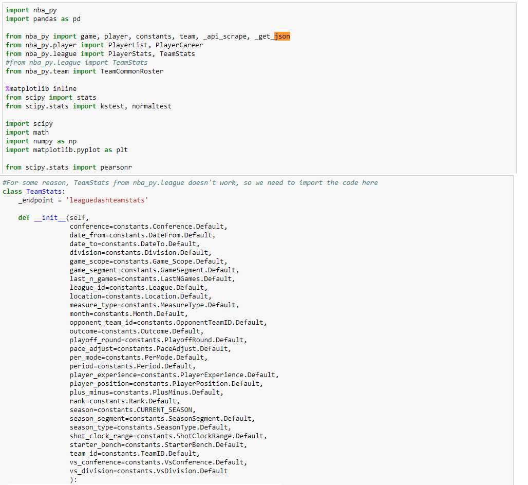
We found a very helpful API called nba_py that would scrape and organize data from nba.com. Here is an example of a class within the API called TeamStats. The constructor will initialize a TeamStats object, first with default data from the constants file. This object contains some important fields we will want to use later such as "rank." In order to actually instantiate a TeamStats object with useful data, we can input some parameters from the self.JSON section. For example: TeamStats(team_id = 1610612737, season ='2000-01').overall() will essentially scrape data from a specific basketball team (the Atlanta Hawks) from a specific season (2000-2001 season).
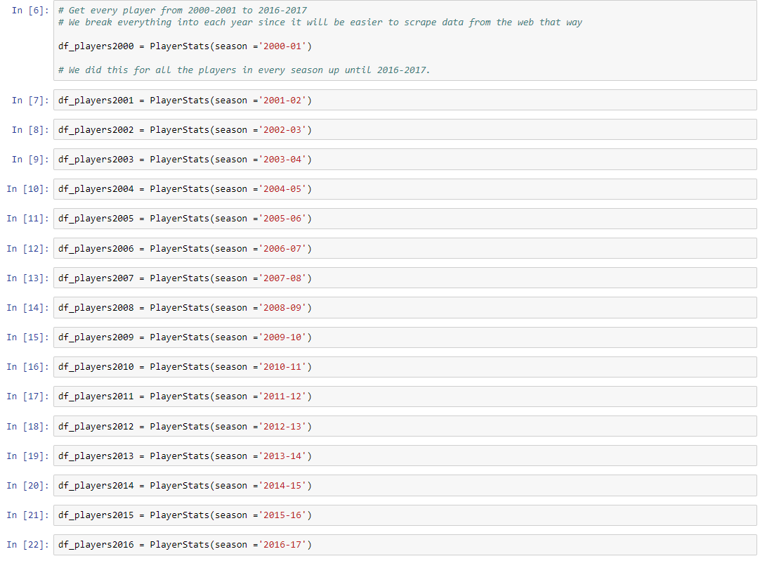
After we had imported all the data, we split certain parts of the available data in certain ways so that we could more efficiently use it the way we wanted to. We first grouped the data into dataframes for all of the individual players’ stats from each season. We had one dataframe for each season from 2000 to 2016, which included all the players in the entire NBA league, as well as many player statistics apart from the six that we were going use to calculate impact. These other statistics included age, games won and lost, rankings for each statistic, and even number of fantasy points, amongst others.
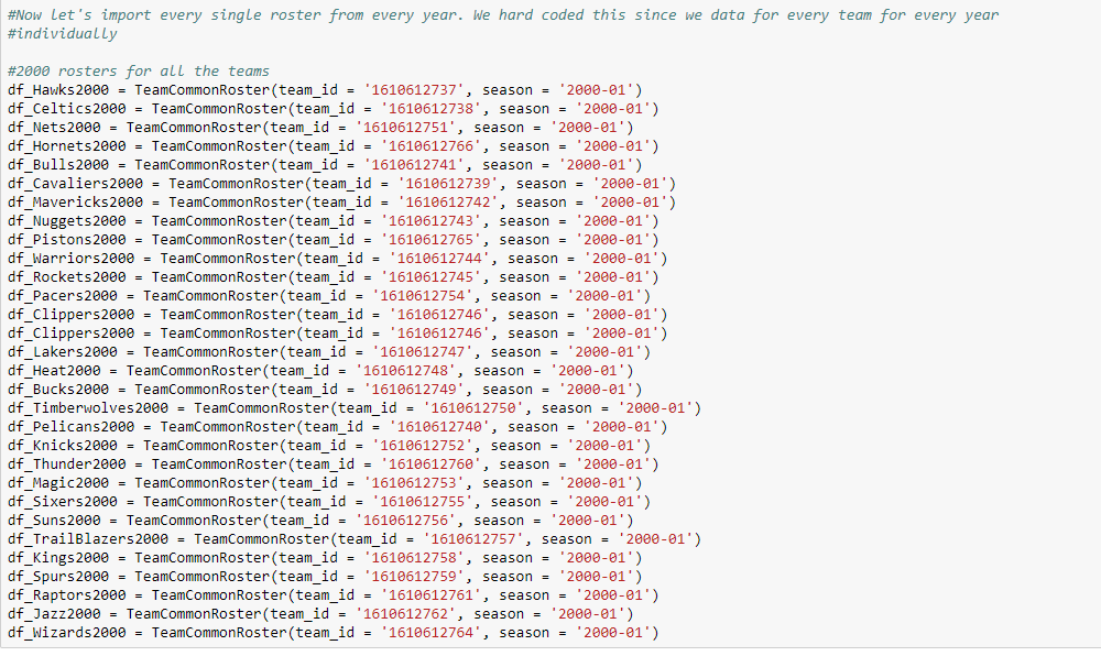
After organizing the individual player data, we organized the team data. For each year, we organized each team’s roster for each year into a dataframe. For example, from the year 2000, we had 30 rosters, 1 for each of the 30 NBA teams. We repeated this process to obtain all the rosters from 2000 to 2016, a grand total of 510 rosters. Now after this initial organizing, our data was grouped in ways that would make it a lot easier to call on in our cleaning stage.
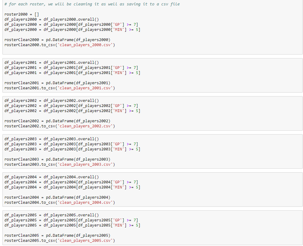
Now, we have all the data we essentially need. It's time to throw away some unnecssary data. One criteria we had was that a player must play at least 7 games. This gets rid of players who get injured or sign really quick contracts with some teams. Another criteria we had was that a player must average at least 5 minutes of playing time a game as their impact to the team will most likely be insignificant. We now put this cleaned data in 17 CSV files, one for each season.
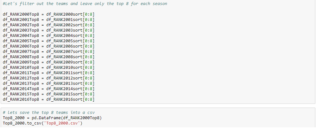
We only want the top 8 teams from each season to compare, so we created dataframes for each season in which we listed all 30 teams by name (which corresponded with a unique team ID). We then took these dataframes and made new ones in which we had sorted teams by the number of wins in a descending order. So, the top teams at the top of the dataframe would be the teams with the most number of wins, and those at the bottom with the least. As mentioned earlier, we then cut each dataframe to contain only teams with the top 8 wins.
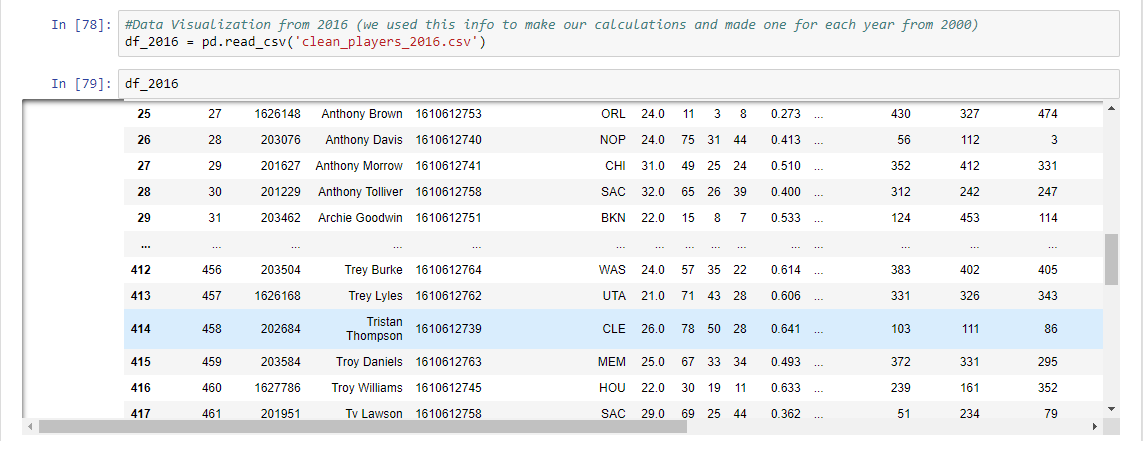
And now, we have data for each player from each of the top 8 teams for the season. Here is an example with the 2016-2017 season as an example.
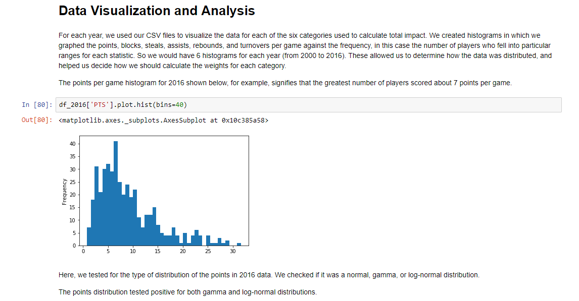
For each year, we used our CSV files to visualize the data for each of the six categories used to calculate total impact. We created histograms in which we graphed the points, blocks, steals, assists, rebounds, and turnovers per game against the frequency, in this case the number of players who fell into particular ranges for each statistic. So we would have 6 histograms for each year (from 2000 to 2016). These allowed us to determine how the data was distributed, and helped us decide how we should calculate the weights for each category.The points per game histogram for 2016 shown on the left, for example, signifies that the greatest number of players scored about 7 points per game.
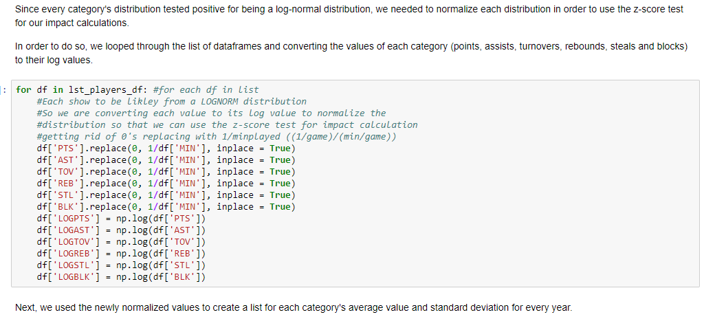
Since every category's distribution tested positive for being a log-normal distribution, we needed to normalize each distribution in order to use the z-score test for our impact calculations (z-score tests are only effective when the distribution is normal). In order to do so, we looped through the list of dataframes and converting the values of each category (points, assists, turnovers, rebounds, steals and blocks) to their log values.
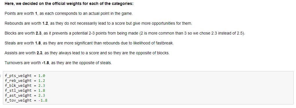
Next, we used the newly normalized values to create a list for each category's average value and standard deviation for every year. Because we are essentially measuring how good a player is, we need to determine the amount of points for each of the 6 categories. We settled for the following:
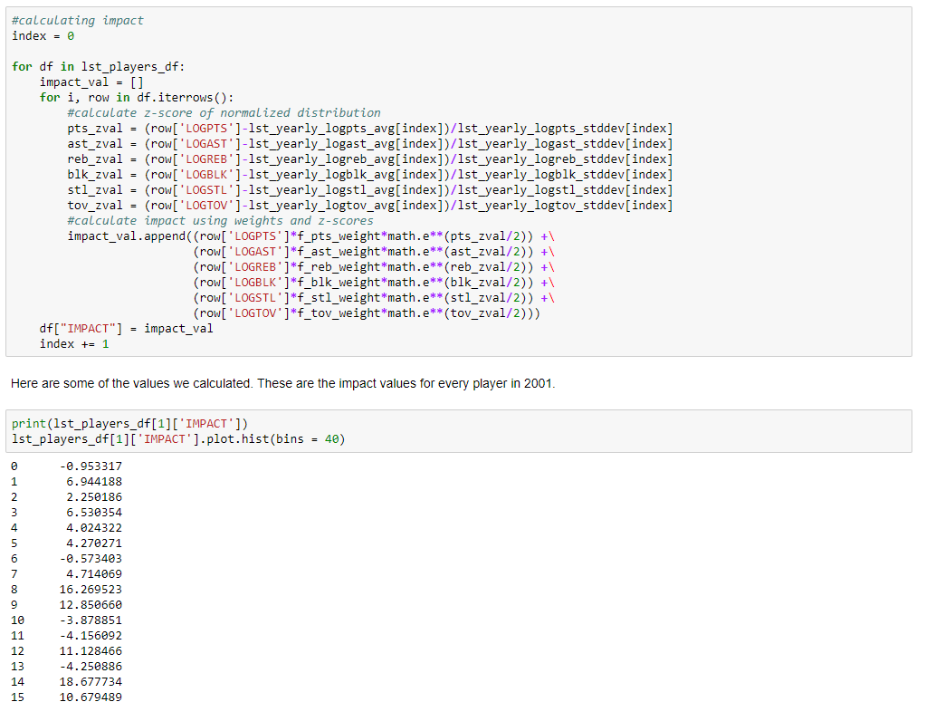
Using the weights from above, along with the averages and standard deviation values, we looped through the list of dataframes and calculated the z-values of the normalized distributions for each category. We then combined the weight of each category with the z-value to create an impact value for each player (refer to code for actual equation). As we did this, we created a new row for each category to store the corresponding values. We then created a dictionary for each season that contains each team's players' individual impacts. Doing this allows us to see the impact distribution of each team, which we can finally analyze. Here are some of the values we calculated - the impact values for every player in 2001.
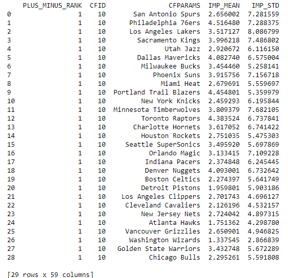
We can determine the average impact of each team, as well as the standard deviation of impact (what our hypothesis is based on). We calculate these values using the "mean" and the "std" functions as we loop through each team and add these values to the dictionary. We will then append the average impact and standard deviation of impact values to new columns in the list like so. NOTE: Average Team Impact
refers to how the well the team does as a whole. In this case, a high average team impact means the team recorded better stats than the rest of the league. This number will most likely be positive since 5 stats grant a positive value (points, rebounds, assists, steals, blocks), with turnovers being the only negative value.
Standard Deviation Impact
refers to how spread out the team's stats were; essentially the gap between skill levels. A high standard deviation impact implies that a few players within the team stand out amongst the rest of the team while a lower standard deviation implies that a lot of players on the team are around the same skill level.
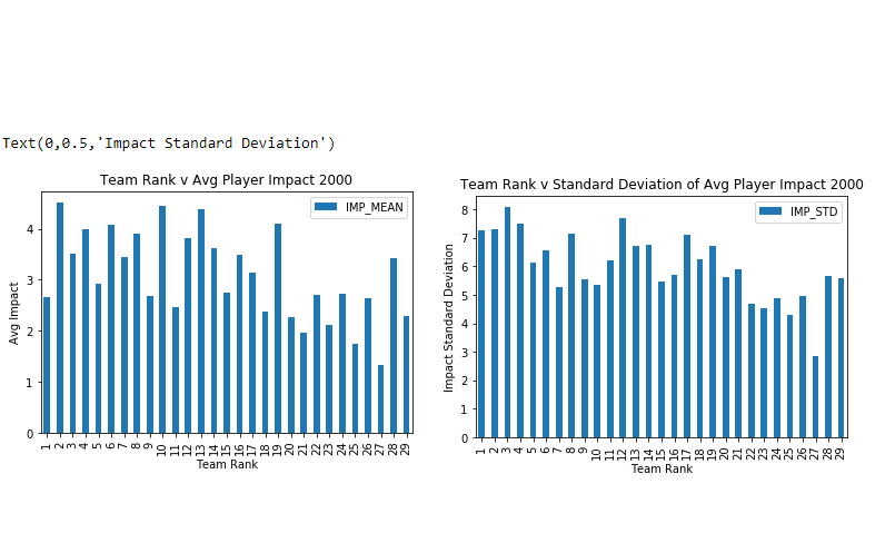
We created bar graphs that display the average player impact vs team rank for each year from 2000 to 2016. Average player impact rating is displayed on the y-axis, with rank, as defined earlier as the top 8 teams in the regular season by win count, on the x-axis. So, the first (leftmost) bar for above the number “1” shows the data for the highest ranked team, and last the bar above the number “29” shows the data for the lowest ranked (last) team. For each of these years, we also created graphs that displayed the standard deviation of average player impact vs team rank for each of these years. In these graphs, we have displayed standard deviation on the y-axis, and rank on x-axis. So, we have 2 graphs for each year.
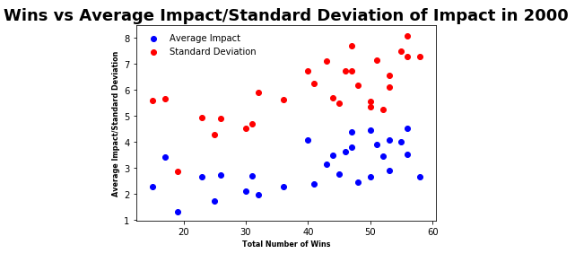
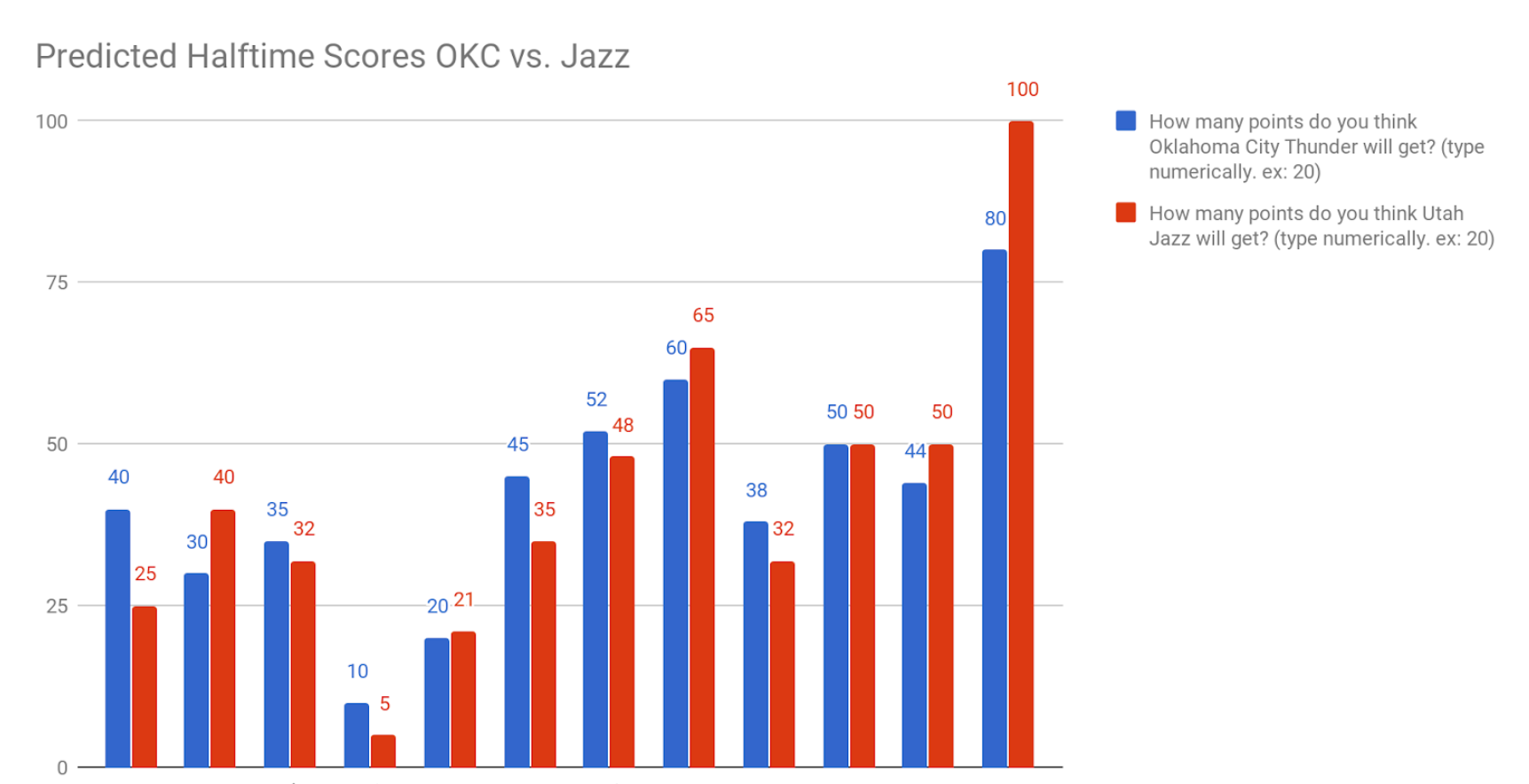
After creating the two graphs for each year, we realized that we couldn’t just look at these graphs to see any trends on how average player impact and standard deviation of impact together are correlated with team rank. So, we created scatter plots to better see the relationship between the data. On the y-axis we now have the numbers for both standard deviation and average impact, and on the x-axis we had the total number of team wins for that particular season. Points in blue show the average player impact related to team wins, while points in red show standard deviation related to team wins. What we will be looking for is a positive correlation, which will show that higher average player impact or team standard deviation of impact will lead to more wins. Here is the scatterplot for 2000.
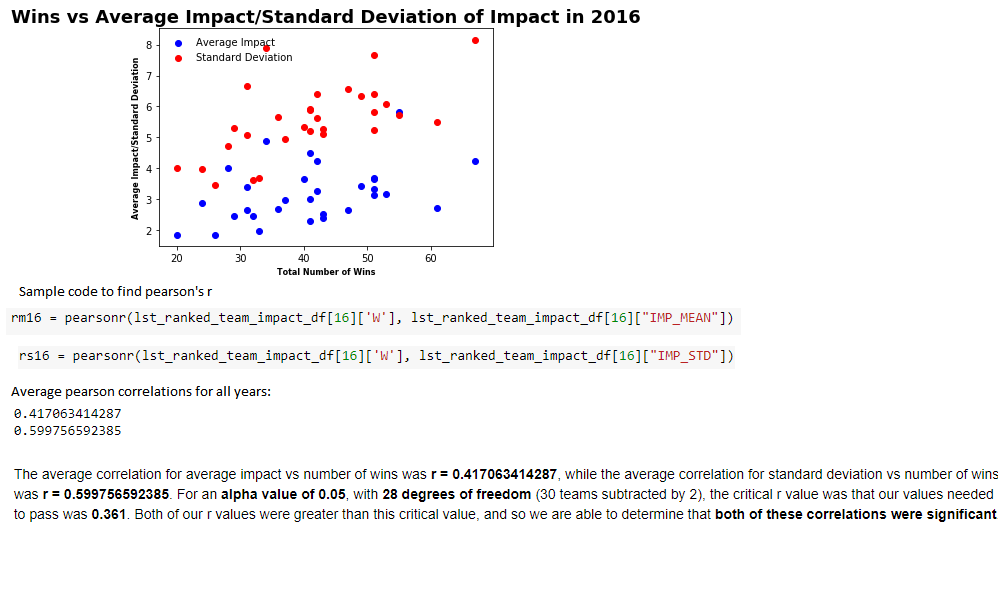
Using python to calculate the Pearson correlation coefficient (denoted as r) to calculate the correlation of both samples. The average correlation for average impact vs number of wins was r = 0.417063414287, while the average correlation for standard deviation vs number of wins was r = 0.599756592385. For an alpha value of 0.05, with 28 degrees of freedom (30 teams subtracted by 2), the critical r value was that our values needed to pass was 0.361 (from the Pearson's critical value table). Both of our r values were greater than this critical value, and so we are able to determine that both of these correlations were significant.
This significance allows us to conclude that in general, teams that win more games (and so are higher ranked) tend to have a higher average impact as well as a higher standard deviation of impact. Although the higher average player impact matches our initial assumption, our actual hypothesis was ultimately incorrect. We also hypothesized that there would be low variance of average player impact between players, but our results seemed to show otherwise. As standard deviation of impact was positively correlated with number of wins (and this correlation was significant), we can see how this variance in fact tends to be higher for good teams.

Looking at the results, we can understand why teams with higher average player impact will generally do better. On these teams, more players are involved in team success, as more players have an impact on various statistical categories and so are better able to help the team in winning games. With a higher average player impact, these teams embody the idea of basketball being a “team sport” in which all players must contribute in some way for the team to be able to do well, rather than just having one great player.The fact that standard deviation of impact tends to be higher allows us to come to the conclusion that, in general, teams also do need those exceptionally good players. These higher average player impacts for winning teams, we determined, are not only caused by more players being involved, but also by having a few individual players whose average impact is significantly higher than their teammates. To put simply, all players must “step up their games” for their team to do better, but there also must those few players who are really something special. A team effort combined with the presence of all-star caliber players is critical. Both factors must be present simultaneously for teams to be good. In terms of application, NBA teams should invest in a few high caliber players and then invest in younger, potentially cheaper players who have a high upside.
The Take Away
Saying that this data science project was a good learning experience would be an understatement. Prior to this, I have never seen anything like this before, not in any class, nor on anyone else's portfolio. Coming back to this project, it took a while for me to relearn all the science. We answered a very simple question, yet the research behind it was enormous; it made me realize how we sometimes take information for granted: it may take years just to answer a very simple question. If I were to recreate this entire project solo, it would take many months to fill in the roles of my teammates.